
 1 day ago
1
1 day ago
1 
Movie posters have to squeeze an entire sales pitch into a single image, so a little Photoshop trickery is practically inevitable. Sometimes, however, it becomes the only thing anyone can see. Actors suddenly grow impossible limbs, faces appear where faces have no business being, and people who are supposedly standing together seem to exist in completely different dimensions. The internet has spent years collecting these strange designs, and some have become nearly as memorable as the movies they were supposed to advertise. The funniest examples are not necessarily terrible posters, either. They are simply images that become increasingly confusing the longer you stare at them. Here are 15 famous movie posters that make no sense.
 ©Reddit
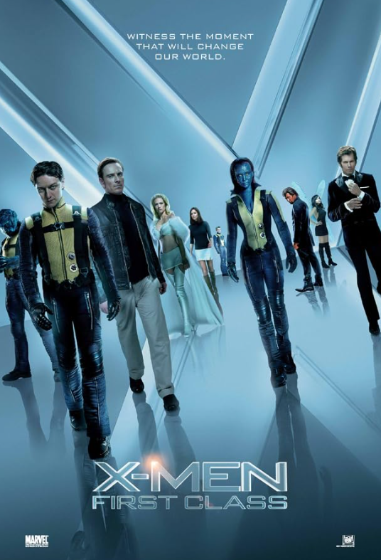
X-Men: First Class (2011)
These character posters place James McAvoy and Michael Fassbender’s faces over silhouettes of their characters’ older selves. The intended past-meets-future idea is there, but the result looks like two enormous floating heads inexplicably trapped in other people’s bodies.
 ©Reddit
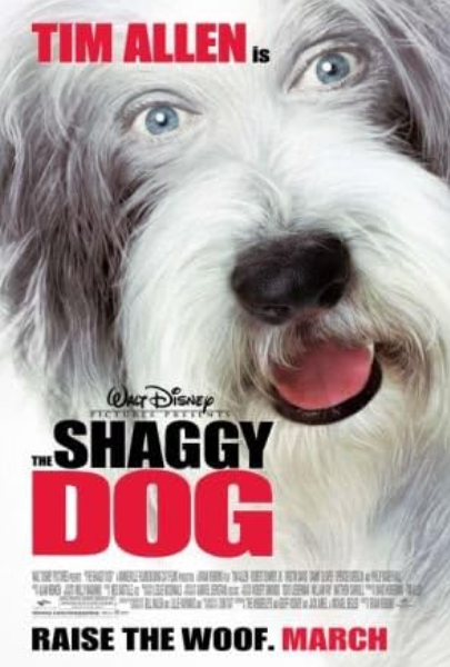
The Shaggy Dog (2006)
Turning Tim Allen into a dog was already the movie’s entire premise, but the poster took the concept somewhere much stranger. His very human eyes were placed onto a dog’s face, creating an image internet users still regularly bring up when discussing bizarre movie posters.
 ©Reddit
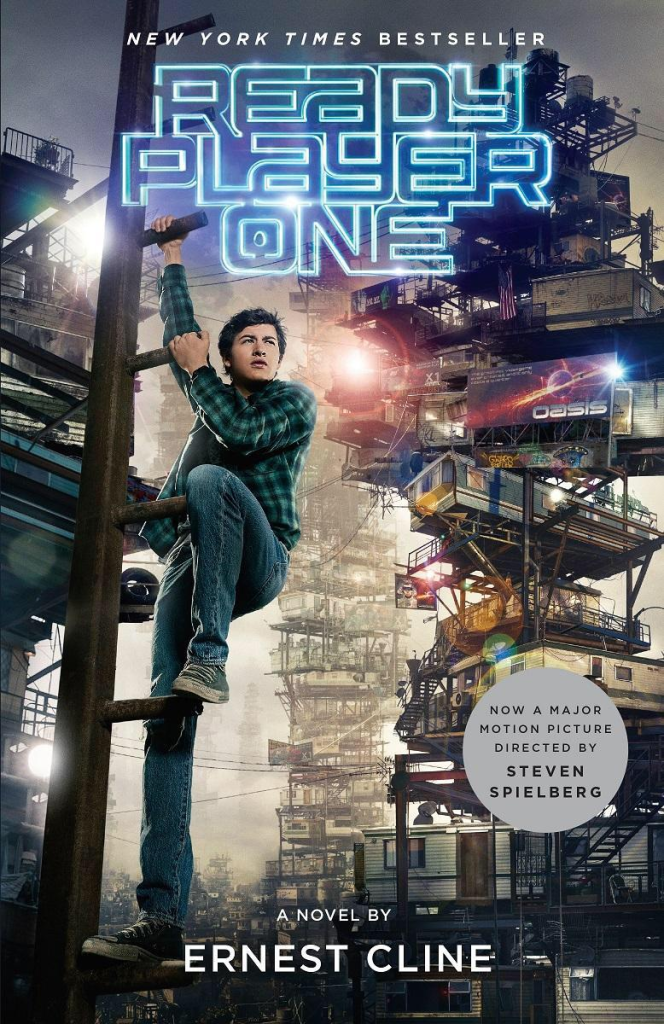
Ready Player One (2018)
Tye Sheridan’s leg became the unexpected star of this poster because it appears to stretch an incredible distance down the ladder. Perspective can actually explain much of the apparent distortion, but that did little to stop the unusually long limb from becoming an internet joke.
 ©Reddit
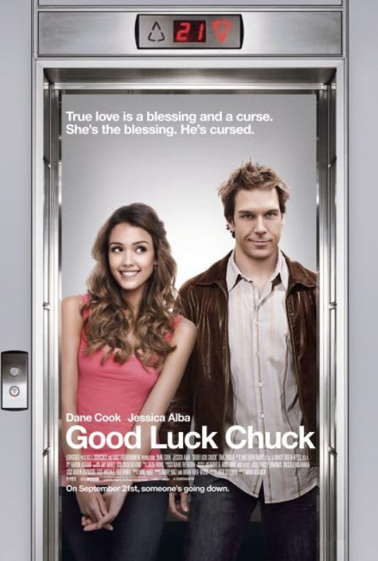
Good Luck Chuck (2007)
Jessica Alba and Dane Cook are supposed to be sharing one cozy image, yet almost nothing about their positioning looks natural. The lighting, proportions and poses make the whole thing feel as though several completely unrelated photographs were assembled into one.
 ©Reddit
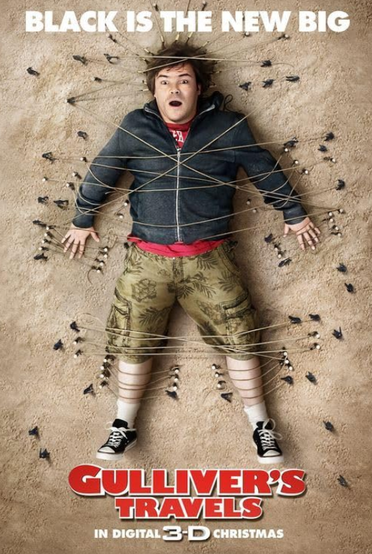
Gulliver’s Travels (2010)
Jack Black’s shocked expression makes sense when tiny people have tied him to the ground. His mouth is another story: look closely and his teeth appear to have vanished entirely, turning a simple reaction shot into a surprisingly strange Photoshop fail.
 ©Reddit
My Big Fat Greek Wedding 3 (2023)
A family portrait should be one of the easiest poster concepts imaginable. Somehow, the aggressively smoothed faces left viewers wondering whether they were looking at the actors or their wax-museum counterparts.
 ©Reddit
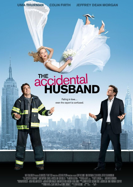
The Accidental Husband (2008)
Uma Thurman is caught between Colin Firth and Jeffrey Dean Morgan, but fitting three people into the same image apparently proved complicated. The actors appear to occupy slightly different planes, turning a simple romantic-comedy setup into an oddly assembled human collage.
 ©Reddit
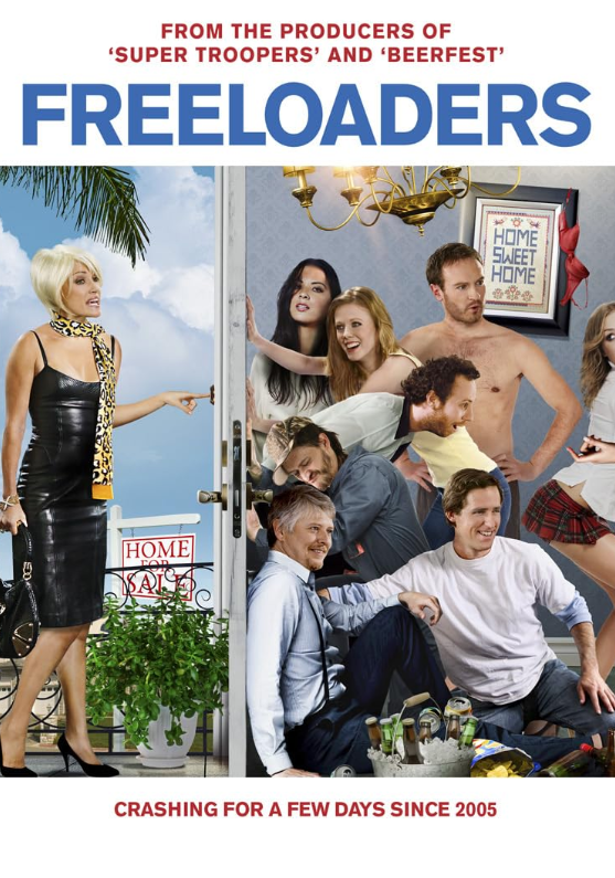
Freeloaders (2012)
There is something strangely artificial about nearly every part of this crowded poster. The cast appears awkwardly pieced together, while even the bucket and crushed cans at the bottom look pasted into a scene that never quite comes together.
 ©Reddit
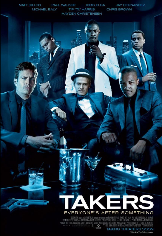
Takers (2010)
This group shot gets stranger with every face you inspect. Several heads look noticeably oversized for their bodies, while wildly inconsistent lighting makes the cast appear to have been photographed in completely different places.
 ©Reddit
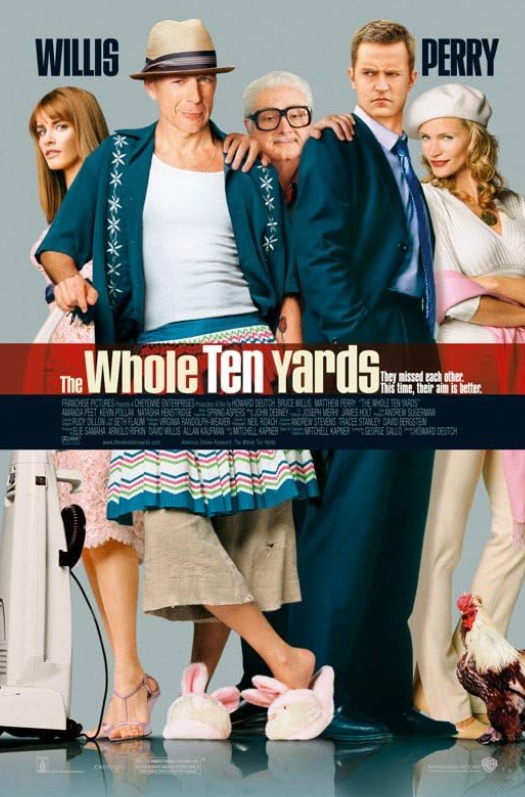
The Whole Ten Yards (2004)
Splitting this cast photo across the title creates a bizarre optical illusion: everyone’s legs seem almost disconnected from their upper bodies. The strange proportions only make the accidental cut-and-paste effect harder to unsee.
 ©Reddit
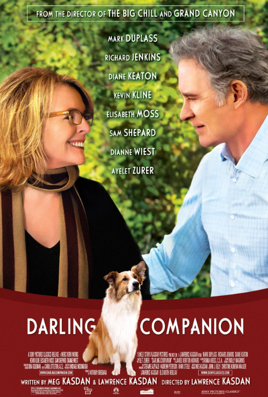
Darling Companion (2012)
Diane Keaton and her dog should have made for a perfectly simple poster, but the finished image became another example of awkward Photoshop. Critics specifically called out the clumsy editing, which makes an otherwise ordinary scene look strangely artificial.
 ©Reddit
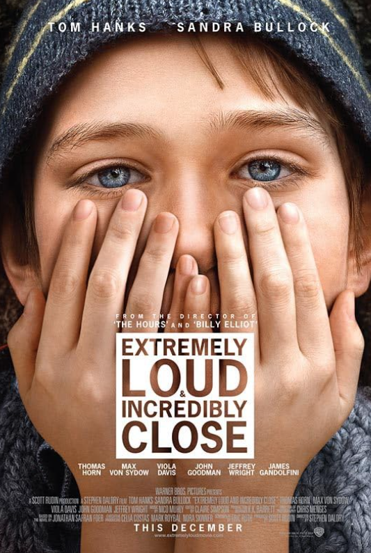
Extremely Loud & Incredibly Close (2011)
The hands covering the boy’s face are much closer to the camera than everything else, creating an exaggerated sense of scale. The forced perspective turns a simple portrait into a surprisingly strange optical puzzle.
 ©Reddit
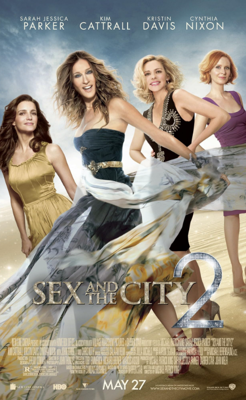
Sex and the City 2 (2010)
Sarah Jessica Parker’s face on promotional material for the sequel became a talking point of its own thanks to conspicuous digital retouching. The smoothing is so heavy that a poster built around one of television’s most recognizable faces somehow makes that face look unfamiliar.
 ©Reddit
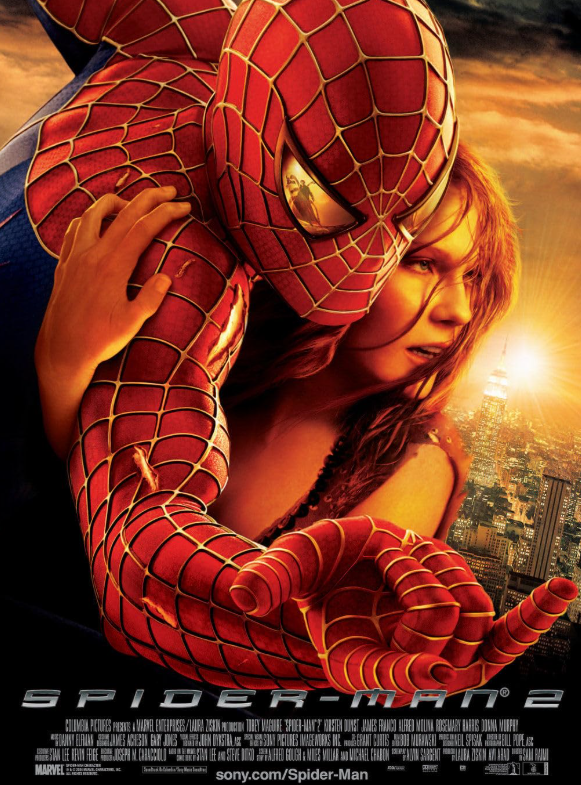
Spider-Man 2 (2004)
Kirsten Dunst’s arm becomes the unexpected star of this poster. As she holds onto Spider-Man, it appears unusually long, creating a stretched-out limb that becomes surprisingly difficult to ignore once you notice it.
 ©Reddit
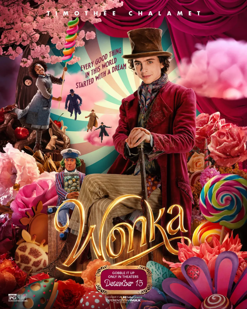
Wonka (2023)
Timothée Chalamet is clearly sitting down, but his proportions tell a stranger story. His upper body looks like a standing pose with seated legs added underneath, leaving Wonka with an unusually long torso.
The post 15 Famous Movie Posters That Make No Sense appeared first on Den of Geek.




 Bengali (Bangladesh) ·
  English (United States) ·